TOUGH
TITTIES
Check it out here:
PROTOTYPE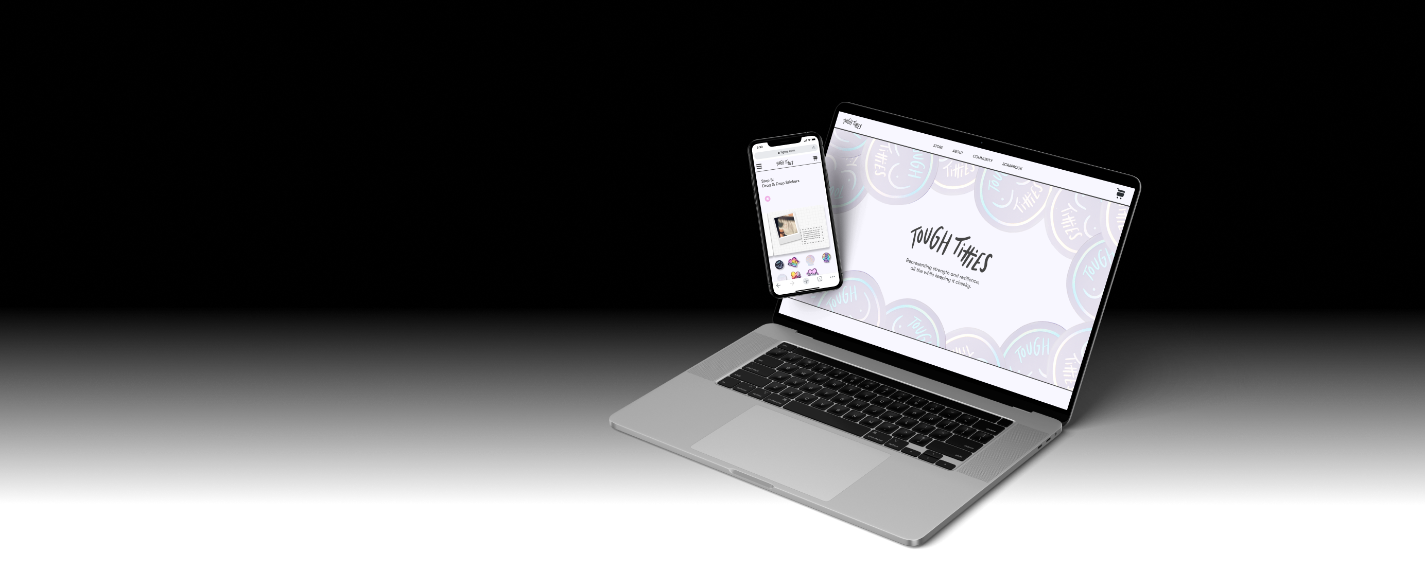
Check it out here:
PROTOTYPEGroup Project
Sahil Sran, Emil Xu, Amanda Eng
Team Lead, Interaction Designer, Visual Designer, Interviewer
Figma, Discord
1 weeks
Eunoia is an annual hackathon that pairs designers and clients from diverse backgrounds to create solutions to their unique business needs. The team was assigned to Tough Titties: an offshoot of local artist Emma Hands’s brand that she wanted to expand into its own business venture. To this end, she needed a website to launch her new breast cancer-focused product line. Emma had already created a rudimentary website on Squarespace, but the Tough Titties product line required a professional touch that the team was happy to supply.
The team learned from interviewing Emma Hands that she values building personal connections with customers rather than being a pushy salesperson. Emma had also cultivated an empowering, people-focused community that set it apart from her competitors. The team unanimously agreed that the stories of her customer base had enormous potential to leverage Tough Titties. We now had direction and one guiding question.
How can we use storytelling to enhance the growth and popularity of Emma Hands' Tough Titties brand, showcasing the products and the diverse community of customers at the storefront?
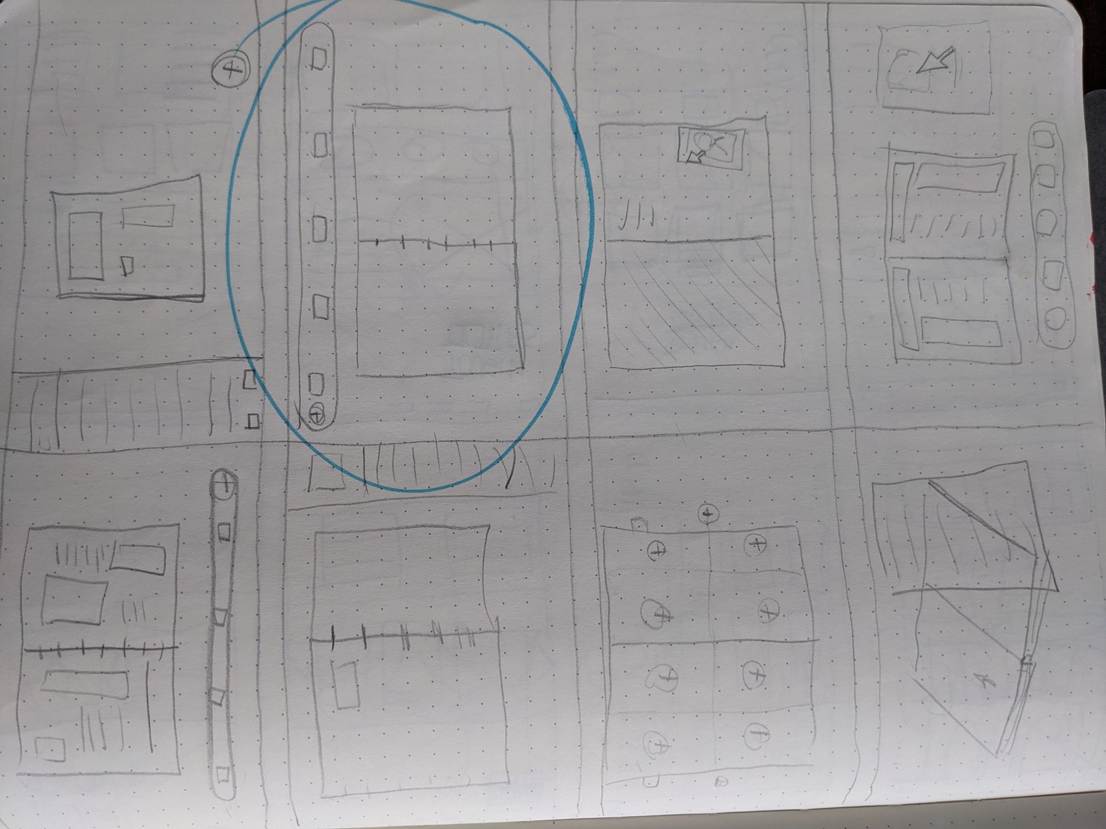
After a long ideation session, I proposed the idea of creating a Tough Titties community scrapbook, which would be a visually appealing format that enables customers to share their stories and experiences related to their purchases of Tough Titties products. It is a guided process where users can customize the visual features of their scrapbooks and share them with the community.
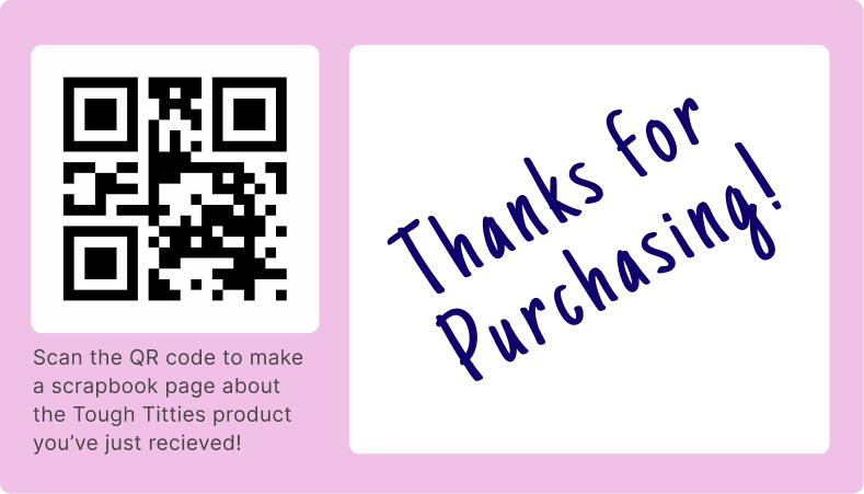
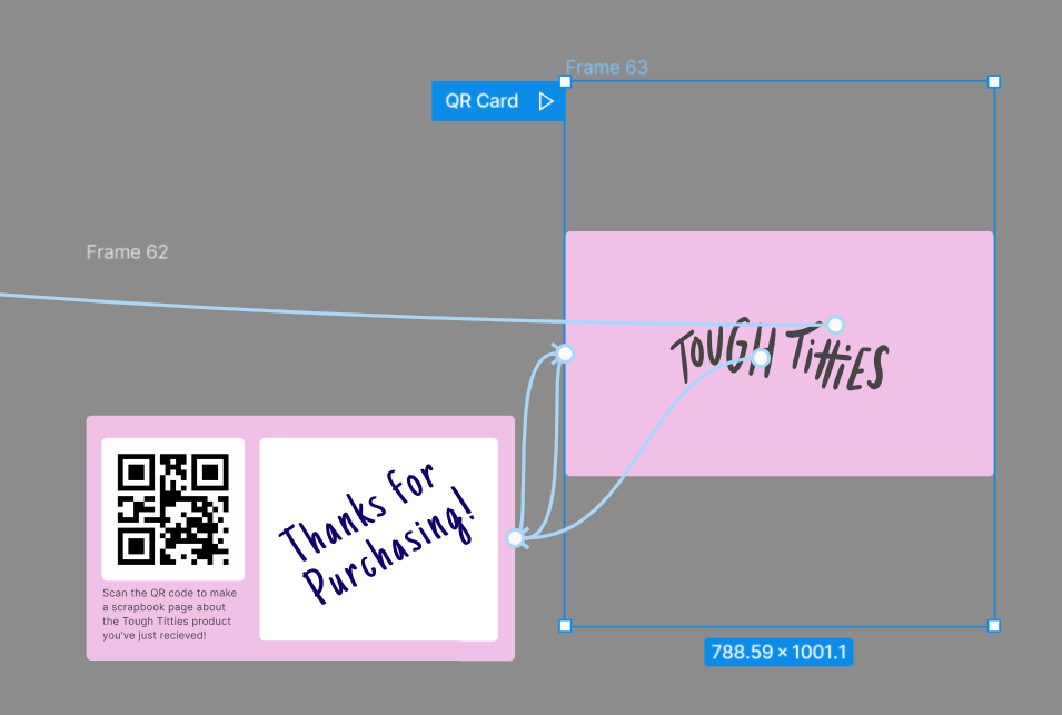
After a purchase, customers unlock the Scrapbook feature by scanning a QR code included on the thank-you note that Emma already includes in all her products. This method of entry has proven to be an intuitive and accessible entry point for the user.
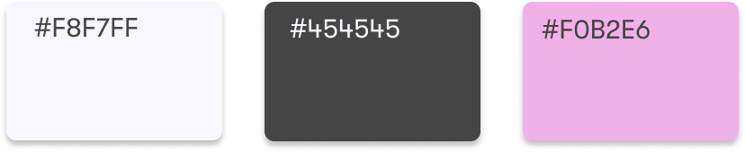
Ivory was chosen for the background to signify calmness without having the sterility of the color white. For legibility’s sake, charcoal was employed in textual elements, striking a balance between maintaining low contrast and making the text easily readable. Tough Titties’ branding’s pink was used for interactive features as it stood out amongst all other visual elements. In addition, using this color sparingly amplified its presence amongst all other visual elements.
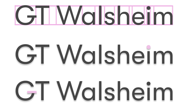
GT Walsheim’s wide character length allowed it to occupy the expansive whitespace of the horizontal fields used in the website, especially in vertically justified text. Its quirky and wholesome characteristics due to the enlarged dot on the “i” and elongated bar on the “G” makes it a font fit for a sublime website design.

Emily initially designed the landing page of the website, and the rest of the team subsequently refined it through further iterations. Sahil was responsible for the commerce pages. Amanda refined the navigation menu that I initially crafted. I took on the responsibility of determining the interaction patterns and visual direction for the community scrapbook.
One element that I was particularly proud of was the QR code that the user scans to access the scrapbook. I wanted to make it flippable as though it was a physical item to drive home its purpose to the user.
Amanda and Emily conducted usability testing for the final prototype. Three anonymous participants tested the prototype of navigation and scrapbook extension, starting from the QR code entry point to the Community page.
The following findings were surfaced:
- Creating a scrapbook entry was intuitive, easy, and fun.
- The Community page successfully embodied Tough Titties’ customers through direct user participation.
- The ability to add stickers to the scrapbooks was popular as they granted users the most amount of creative expression.
Out of 48 teams, this design solution won the Eunoia UX Award. We received 3rd place at the end since 2 of the teammates could not make it to the final presentation and 2 men presenting a product intended specifically for women as a target demographic is bad optics-wise. Still, Emma Hands loved the redesign and said she looked forward to implementing the community scrapbook.
AMVETS
Designed the checkout for a veteran charity's donation page
Ridge Meadows
Chamber of Commerce
Redesigned the website and prototyped the map feature
CybersnakeX
Designed UI elements as well as participated in UX for combat system
Tavern Buddies
Directed the creation of a mobile app that connected Dungeons & Dragon players
Gotchi
A speculative UX project with the purpose of helping users manage electronic waste via a cute accessory
Vancouver Tool Library
Redesigning website and improving self-checkout to reduce work load on staff
Fallen London
Social media integration for the roleplaying game Fallen London