TAVERN
BUDDIES
Check it out here:
PROTOTYPEGroup Project
Jason Tran, Naod Asaye, Raymond Chan
Team Lead, UX Researcher, UI Designer
Figma, Discord
6 weeks
Behold! Dungeons & Dragons (DnD): A massively successful tabletop roleplaying game in the peak of its popularity. DnD is not only an intensely fun game, but proven to help socially anxious and nuero-atypical folk hone their people skills in a low stakes environment. However, more and more people choose to play DnD online especially after the pandemic. A game like this ought to be experienced in real life with real people. So the question is, how can we encourage DnD players to get together and play the game in real life?
Enter Tavern Buddies: a platform that connects DnD players in your area to create a communal experience for local adventurers.
Before ideating on what Tavern Buddies would eventually become, the team started researching the community that revolves around Dungeons & Dragons (DnD). After conducting several surveys (iterated throughout the development cycle), the team came across some pertinent conclusions:


75% prefer playing with friends online vs real life.
88% would meet their online friends in real life if they had a chance.
They posit anxiety and safety concerns as major reasons for playing online.
Otherwise they are more than happy to play DnD face-to-face with people who have similar interests.
Even though men mostly play Dungeon & Dragons, the number of women playing has been on a stratospheric rise
though there is still a massive disparity between the genders.
Women have different concerns than men
when it comes to their goals. The most major concern relates to privacy and safety issues. Women simply have
more things to be worried about when meeting new people.
From these findings the team extrapolated that if certain factors were mitigated, DnD players would be happy
to play the game in person. This was pertinent as studies show that people with social anxiety can use DnD to
practise social interactions in a low-stakes environment. From these findings, this project's current
iteration seemed obvious in hindsight.
Before proceeding to development, however, the team used
additional UX tools to achieve a greater understanding of this undertaking.
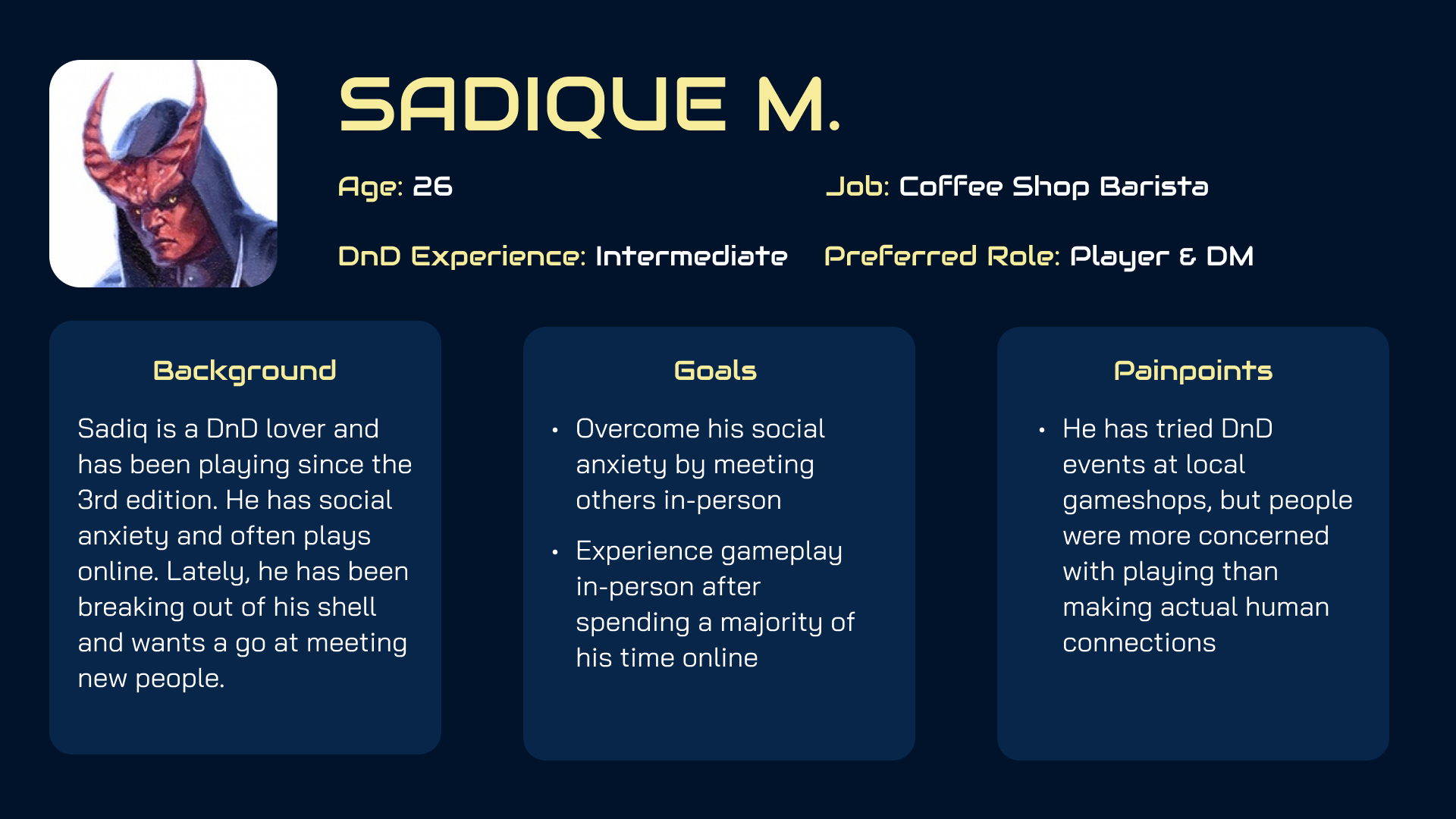
Before prototyping, artifacts that would represent the typical user base of the app were crafted. While not defintive, the team kept them in mind as the target demographic as we developed the features of the app.
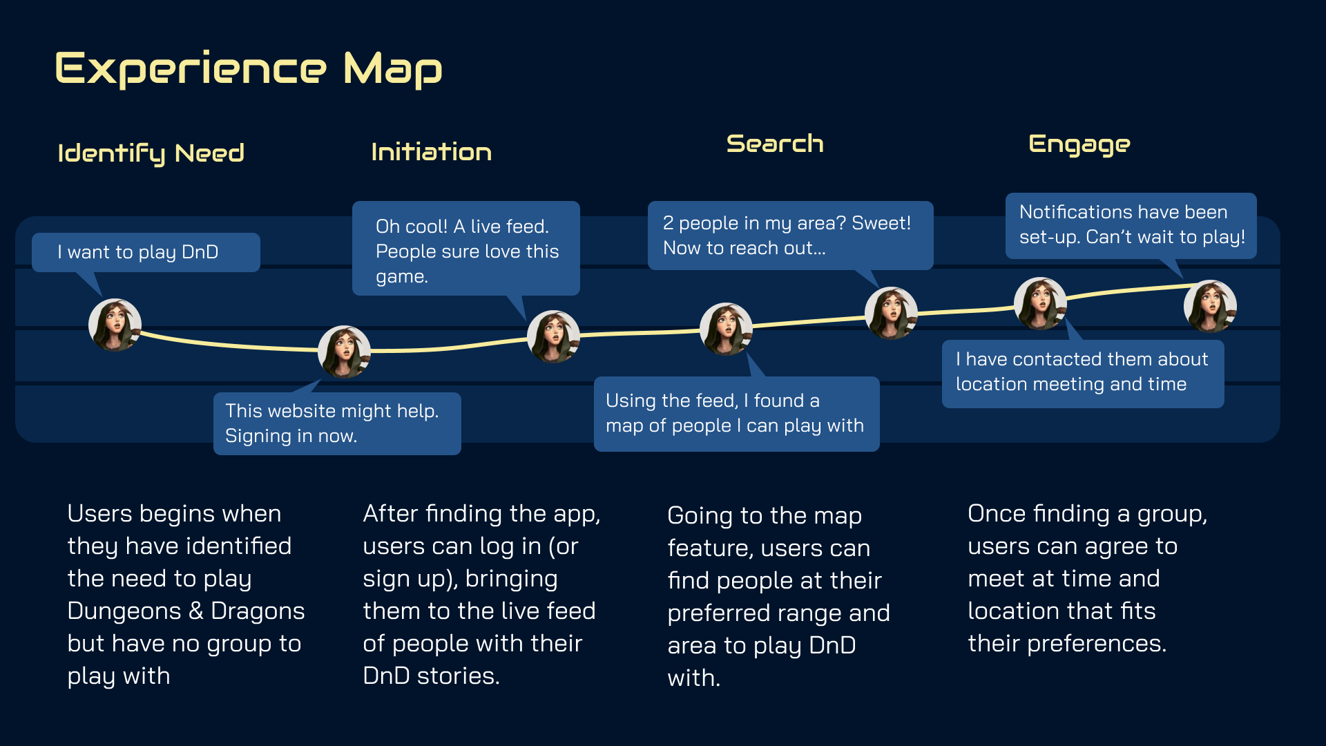
An experience map of one of the Persona characters was created in order to flesh out the user journey from beginning to end. This allowed us to flesh out all the interactions the user would have to go through in order to achieve their goals.
In addition, a user scenario was crafted to further flesh out the needs of a new user.
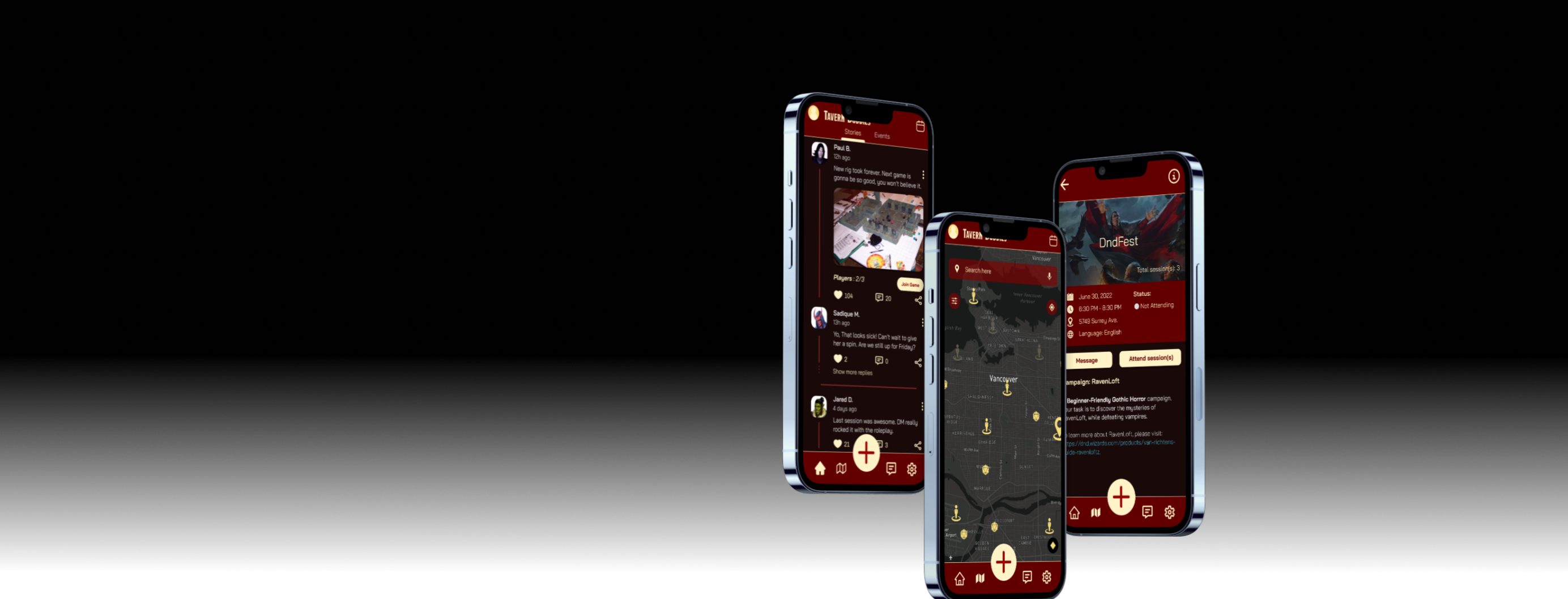
The first prototype involved the team figuring out what the flow of the app would be. The team wanted to block in the design features first while observing core principles of UI design, most importantly the principle of user autonamy. Users had to be made aware of the fact that their data was being used. Failing to consider this would have been a major breach in their privacy. More information on Tavern Buddies's features can be found on the dedicated website.

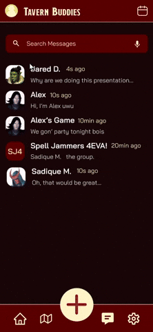
The team decided to go against the grain when coming up with what the visuals of Tavern Buddies would later become. It was a goal for Tavern Buddies to stand out from the more subdued color schemes of websites like facebook or twitter. The color palette was inspired by the colors that Wizards of the Coast (the proprietors is DnD) used in the books they publish. Red with gold trims gave the app a subdued regal look that distinguished it from other apps.

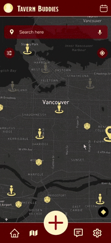
Having finished all the prep work, the team finally began to work on polishing the visuals of our app. Following that, we made additional changes to the app features after recieving professional critique from industry experts. The most pertinent changes included refining the colored chips in the user profile so that that they had more contrast with the typeface's color. In addition, map visuals were updated to a darker pallete so that users wouldn't get whiplash from the the screen changing to a brighter screen color after accessing the map feature.
Check out the prototype.
The development of this app was not a linear process. The team went back and forth on various aspects of research and prototyping so that we could fine tune the final product. While the end product was satidfactory, for future considerations, the team wanted to add an onboarding feature, but decided against it to avoid feature bloat. The team also considered scaling back on social features like group creation, letting people simply use their social media platforms of choice to figure out how they would play together.
AMVETS
Designed the checkout for a veteran charity's donation page
Ridge Meadows
Chamber of Commerce
Redesigned the website and prototyped the map feature
CybersnakeX
Designed UI elements as well as participated in UX for combat system
Gotchi
A speculative UX project with the purpose of helping users manage electronic waste via a cute accessory
Vancouver Tool Library
Redesigning website and improving self-checkout to reduce work load on staff
Fallen London
Social media integration for the roleplaying game Fallen London
Tough Titties
An award-winning redesign for a breast cancer awareness brand